What is Accessibility — and why does it matter?
The basic concept of web accessibility is to be sure that your website follows proper standards which will make it easier for all of your site visitors to understand and navigate your web content.
There are also legal reasons to have an accessible website — there are federal and state requirements for accessibility. We use WCAG 2.1 (Level AA) as the web accessibility standard.
In order to assure that our websites are accessible to and usable by everyone, website owners should follow these guidelines.
Alternate Text
- Screen Reader software can not “see” an image on a webpage — so the image needs to be “coded” in a way for the software to be aware of it and know how to handle it
- If an image is purely decorative — you do not need to supply alternative text
for example: an image of a person does not need alt text (which would most often be their name) if their name is included next to it in text - Images on your website that convey meaning must have alternative text descriptions
- Cascade will always prompt you for alternative text
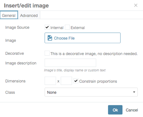
- use Image description to add descriptive alternative text
- check Decorative if this is a decorative image (About the University webpage Decorative Image Example)
Meaningful Link Text
- Screen Reader software can pull up a list of links for easy navigation
- Link text should be meaningful when read out of context.
For example, links like “click here” and “Read more” are meaningless out of context. - Clear short descriptions make it easier for users to find links
- For example:
change Read More — to — Read More in the Course Catalog
change Click Here — to be descriptive to your destination — Course Catalog - Anthropology Example of Descriptive Links
Headings
- Headings allow screen readers to understand the structure and sections of a webpage
- Screen readers can list all headings on a page (generally with one keystroke) and offer the ability to jump between headings/sections
- Always use Headings in order
— don’t skip headings
— don’t use a Heading 3 (H3) without first using a Heading 2 (H2) - Economics Example of Headings
Color contrast ratio for any created images or for any charts
- Some users have difficulty perceiving text if there is too little contrast between the text and the background.
- Text and background must have a contrast ratio of at least 4.5:1 (or 3:1 for large text – 14pt bold or 18 pt not bold)
- Wesleyan’s red(#d72121) & black can both be used on a white background
but —
red can not be used on black and black can not be used on red - examples of color contrast
- free tools allow you to check the color contrast
Text in Graphics
- Text in images can not be read by a screen reader (nor can it be found in a search)
- Any content that conveys a message should be include in the text, not only in an image
- Humanities website (uses the header image to draw attention for visual users, but also puts the text for non-visual users)
- don’t use a poster as a webpage….
- you can include the poster, but all of the information needs to be repeated as text:
- FGSS Event Posters
- If you want to create an image/button for your website you can — but remember:
- Any text included in an image needs to have:
- clear Alternative Text
- contrast ratio of at least 4.5:1 (or 3:1 for large text)
- example CFA page (very visual, images help them market their performances)
- Grad Office – images with words are repeated
- Romance Languages – buttons in sidebar (alt text and proper contrast)
- Academic Affairs – transparent gray bar under words to increase contrast
- Social Media
- the images you add to your social media feed need to follow the same rules as images on a web page (alt text, color contrast — repeat the words that appear on the image)
- Any text included in an image needs to have:
- Example: don’t send just the graphic in an email — send explanatory text to complement the image
for example: do not send posters as email content — send the poster and explanatory text
Color
- Don’t use color as the only visual way to convey information
- For example: don’t use color alone to let users know what form fields are required — use words or a symbol with the color (required or an *)
- Penn State has an example page
- Missouri State has an example page (green and red buttons)
- When creating charts be sure there is enough contrast ratio between the colors
- an example of a subway map using color as the only way of distinguishing routes
- in most cases, it helps to repeat the raw data in a spreadsheet below the chart or next to the legend/key
- Wesleyan’s Investment Office has an accessible pie chart:
- consider using dots and dashes in lines to distinguish differences
- Penn State has an example page (look near the bottom at the line chart)
Captioning
- All public facing videos on the Wesleyan website need to be captioned
- this includes zoom recordings that are shared with the public
- Captioning can have a cost associated with it, so remember to figure that into your budget
Testing
- Many different types of tools are freely available – many as plugins to your browser
- WAVE plugin for Chrome browser
- Color Contrast checker
- Many Browser Plugins
- Accessibility @ Wesleyan website